This is the first post of a 3 part series, so don't forget to read parts 2 & 3 NOW PUBLISHED!
Hi!
Thanks so much for joining me here.
I have long wanted to blog about my processes behind how I instinctively design spaces. I am really excited to share my ideas, inspirations, approaches and outcomes with you here today. When I finally found this pocket of rare and sacred time to write, I discovered I had so much material, so I have divided this post, featuring our current family home, into 3 parts.
Ever since I was a young girl, I have always loved beautiful spaces and beautiful things and this is what lead me to study interior design. I became particularly interested in the role rooms, interiors and my preferred term, 'spaces', had on our inner being. The way they made us feel. I have always had a resounding desire to help people realise a personal space they care about.
When a wise friend and mentor asked me recently, 'why do I do what I do', my answer was clear.....
...because Space Matters!
So if having a 'space that matters' is the ultimate goal, how precisely does one go about making their space matter? Well for me, it has always been about being in constant creation with my space and ensuing it is an ever evolving and accurate reflection of the direction I want my life to unfold. It's about the big picture of design relevance and the role it plays in my life.
Over the next 3 posts I invite you to discover your authentic home using my own home as an example. I talk about 'Space Healing', my personal design philosophy developed over the last 17+ years, which ensures my spaces feel as good as they look.
I would like to think this post becomes a historical record for the future owners of our treasured home, but more than anything, the absolute greatest joy would be to know that I have inspired you to make your space matter too and given you some tools to help make this happen.
I would like to think this post becomes a historical record for the future owners of our treasured home, but more than anything, the absolute greatest joy would be to know that I have inspired you to make your space matter too and given you some tools to help make this happen.
My Process for designing (healing) the 1920's (original) part of our home
The purchase...
My husband Jason and I bought our Neutral Bay home in 2011 just after our third child Darci was born. We previously lived in a lovely home in Cremorne but due to our growing family we were eager to find our next house. With the market slow it was the perfect time to upsize plus my film editing husband had a few months off work before cutting Baz Lerhmann's exciting new film, The Great Gatsby.

What we were looking for
I had a very clear list of requirements for our new home; Lots of natural light; A large bedroom for our daughters to share; An isolated guest bedroom; A sense of openness without being open plan, (I have never warmed to family living & kitchen all in one room); Scope to create a home we are proud of with greater potential for renovation down the track; Some beautiful established trees; Convenient location of the laundry, parking & bins; And if possible, a corner block, I have always loved corner blocks! The most important requirement however proved to be the most difficult; a home with a soul, a sense of history.

Spotting Potential
Not long after we made the decision to start looking we found 11 Spruson Street, a home that failed at auction twice and one that had been on the market for quite some time. Whilst it ticked all the boxes my first inspection had me existing the door saying it wasn't right. Generally I spot potential quickly but identifying the potential of this home was more challenging and resulted in a few restless nights drawing up plans and scrolling through my camera roll. After a few more inspections I was 90% convinced I could heal this home to a standard we would be happy in. Before we had the opportunity to sell our Cremorne home we bought Neutral Bay.


Probably wouldn't do that again...buying before selling was somewhat stressful!
History of our Home
Our home was designed by B J Waterhouse in 1920, a renowned arts & crafts architect. Two of his more notable and heritage listed homes were Nutcote Cottage, May Gibb's home and his own residence, The Gables, (just opposite our home). Originally our home was the servant quarters to The Gables and was a one bedroom, two storey cottage, on a very large block of land. It was added on by previous owners in the 80's. If it wasn’t for the different shades of roof tiles, the exterior extension appears relatively seamless, but the inside was a different story.
The floor plan was quite unconventional due to its lack of a major corridor and it felt pokey, rambling and claustrophobic. There were very few period features in the original part of the home; a few leadlight windows, a lovely fireplace, tall ceilings, a nice stairwell balustrade and some interesting ceiling lines upstairs with dormer windows. The rest of the home was architecturally baron as was typical of the post war arts and craft era; simple skirtings, cornices, low doorways etc.
The floor plan was quite unconventional due to its lack of a major corridor and it felt pokey, rambling and claustrophobic. There were very few period features in the original part of the home; a few leadlight windows, a lovely fireplace, tall ceilings, a nice stairwell balustrade and some interesting ceiling lines upstairs with dormer windows. The rest of the home was architecturally baron as was typical of the post war arts and craft era; simple skirtings, cornices, low doorways etc.

.JPG)
Looking through our front door Christmas wreath towards the sandstone garage of The Gables.

The original floor plan showing a small entryway through to the corridor and another threshold with nib wall leading to the terrace.
.jpg)
Cottage charm. Can you spot the variation in roof tiles?
.jpg)
Some of the initial renovation ideas I explored. It is so interesting to look back how these ideas have developed dramatically since then.
Previous Remodels
The extension was typically 1980's with terracotta floor tiles raised one step high to accommodate a double garage under the house. Our home had restricted ceiling heights as a direct cause to enable the original roofline to meet the newer adjoining one.
Despite its shortfalls this home had a majestic appeal that was hard to deny. Helped by its large corner block and two of the most magnificent trees, a Chinese elm and crape myrtle, the foundations were all there to create a special residence.
Despite its shortfalls this home had a majestic appeal that was hard to deny. Helped by its large corner block and two of the most magnificent trees, a Chinese elm and crape myrtle, the foundations were all there to create a special residence.


What we wanted people to feel
I often ask my clients, "What do you want people to feel when they walk through your door".
I ask this question not because I want them to state obvious associations like comfort or relaxation, rather, I want them to uncover the essence of what is truly important to them and the life they hope to create. I encourage them to be as specific as they can be so I deeply understand what matters to them.
When it came to our new home, this was an easy question for me to answer. I wanted the people invited into our space to have a personal encounter with our home. With nothing precious beyond repair, there would be no perception of ownership, and they would be in complete control. Whilst this sentiment and intention may not be apparent by looking at my after photos, it was certainly apparent in how I treated people, including my own children, in our home. I was known to open our door to guests, welcoming them by saying, "if our home is not a total mess by the time you and your children leave I will be greatly insulted and take it as a sign that you did not enjoy yourself".
Ultimately, I wanted people to comprehend my vocation as a Space Healer and gather a firsthand perspective for why space matters and it's very real
Ultimately, I wanted people to comprehend my vocation as a Space Healer and gather a firsthand perspective for why space matters and it's very real
physical & emotional effects.

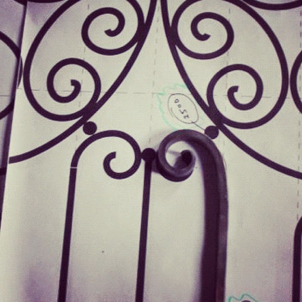

I love our hand wrought gate ,however I was a little unsure of the gloss finish, it wasn't quite what I was expecting. I was hoping for a more aged finish.
Small improvements
We had grand plans to extend the back of the home and possibly add a conservatory but addressing the entry vestibule, correcting the passageway from the old to the new and appropriately decorating the 80's addition become our focus for stage one. In what was a relatively affordable remodel we were able to open up the home and make sense of its rambling floor plan. Small improvements like adding a wrought iron gate to secure an entry alcove, changing the front door's swing and installing panelled glass doors to both the front and powder room made a tremendous improvement to the flow and light.


New front door. What a difference hanging it the other way made.
Improving the flow
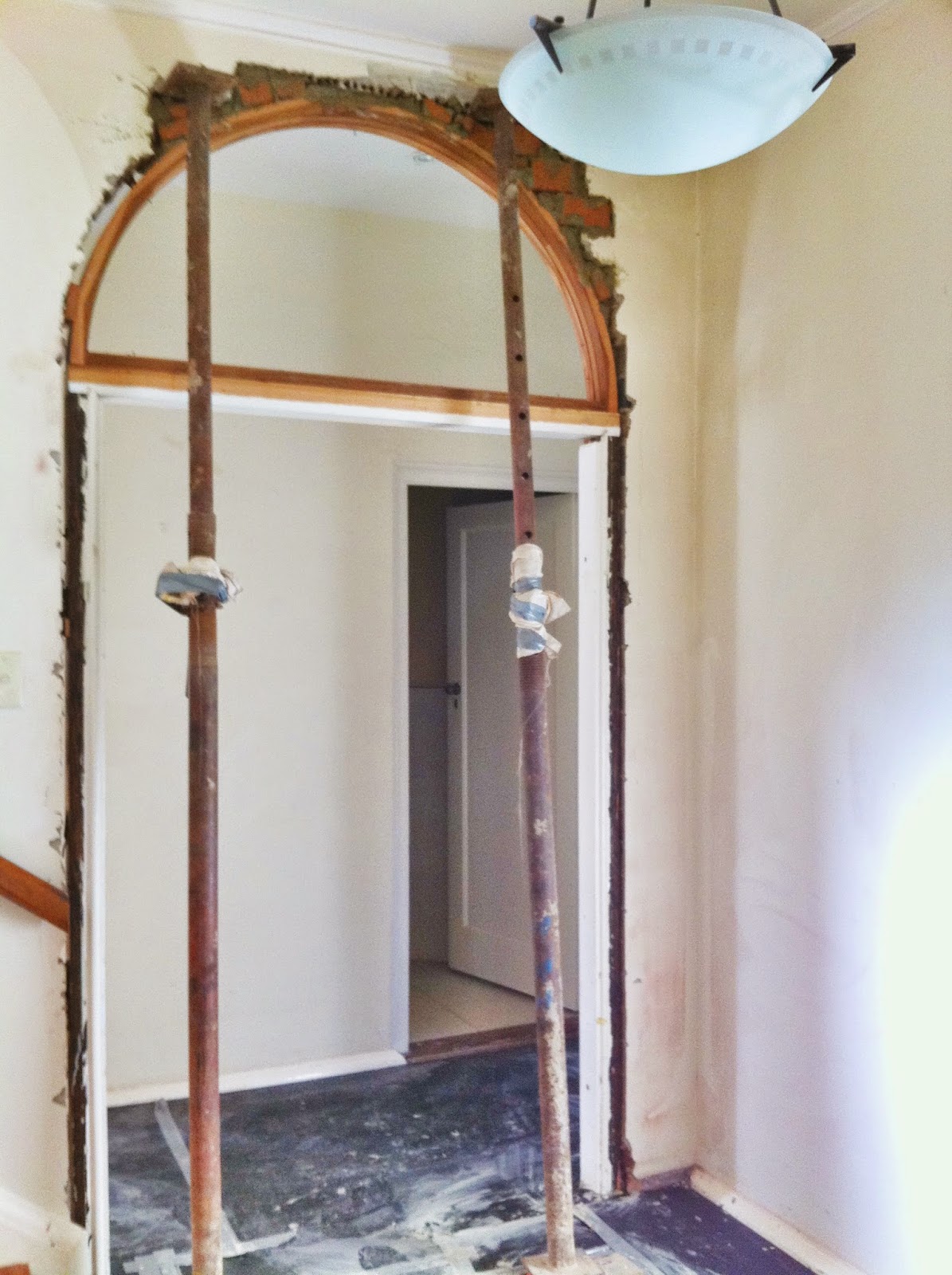
We tackled the confusing journey from old to new by creating the illusion of a longer hallway to transition the two spaces. By removing a threshold and nib wall, we created a continuous ceiling that flowed from the original part of the house to the terrace vestibule, which freely opened up to the back part of the home.
The hallway, which unusually cuts across the width of the house and entered by midsection, appears somewhat short and uneventful. I made it appear longer by visually connecting the terrace vestibule to the hallway passageway. I did this by installing 3 crystal bulb lights, the last of which extended into the terrace vestibule, registering it as one connected space.
The hallway was now becoming a more exciting and essential part of the home, further helped by a dynamic geometric wallpaper, some timber beading to create simple wall panelling, larger skirting boards and a little seated nook under the stairs.
 Removing the wall thickness & doorway leading out to the terrace made a huge impact.
The hallway, which unusually cuts across the width of the house and entered by midsection, appears somewhat short and uneventful. I made it appear longer by visually connecting the terrace vestibule to the hallway passageway. I did this by installing 3 crystal bulb lights, the last of which extended into the terrace vestibule, registering it as one connected space.
The hallway was now becoming a more exciting and essential part of the home, further helped by a dynamic geometric wallpaper, some timber beading to create simple wall panelling, larger skirting boards and a little seated nook under the stairs.

.jpg)

Simple wall panel detail on right.
Finding its grandeur
These small improvements made a huge impact to our ability to enjoy and feel at ease within our home, but possibly the biggest improvement was made in the main entry vestibule. Here I widened the opening to the hallway to match the width of the opposite wider formal room doorway. I also cut in two beautiful leadlight arches to sit above each opening. This instantly gave the grandeur our home was seeking. To finish it off, I added leadlight cabinet doors next to the fireplace and designed them to complement the existing leadlight windows throughout the home. The results seem so authentic you would be hard-pressed to pick they were not original.
Yay, the rabbit warren has gone!

By the way, I dressed our sideboard like this just for the photo shoot. This is not my authentic home though and I really don't like it. It looks like no one lives here. I'll show you later how I really styled it.

BEFORE shot with no arches. Notice the small windows!

Fire place with new leadlight cupboard doors.
Who can spot Jas' AACTA award for The Great Gatsby? Can you tell I am just a bit proud of my amazing husband!?
Who can spot Jas' AACTA award for The Great Gatsby? Can you tell I am just a bit proud of my amazing husband!?


I am forever changing the mantle and coffee table knick knacks.
Multi-use spaces
Decorating the formal sitting room was all about using what we had available. Creating the best space I could using what I had or what I could inexpensively purchase. Eventually we plan to decorate this room in softer colours and plush furnishings, but for now it had to function as a study come lounge room and one which successfully welcomed you from the entry (not looking like an eye sore).
We had many pieces from our previous home and we were fortunate to pick up a few extra pieces such as the green silk curtains and stunning sideboard off the film set of The Great Gatsby. I also found the gorgeous black overdyed kiln rug from Home Furniture on Consignment along with a New York parquetry partner’s desk.
To finish off the room we applied paint stripper to the fireplace wall to create an aged effect. This was initially a makeshift measure until we laid sandstone cladding, but we adore seeing the many layers of paint previous owners have used and now I can't imagine redoing it.

Notice here how hanging the roman blinds above the windows has helped make the windows appear taller.

This sofa and Christopher Hodges artwork were from our previous Cremorne home. I added a few cushions to give it a new lease of life.


The Touch Interiors pop up office whilst we were in-between office spaces.
Love sharing a partners desk with my hubbie.
Love sharing a partners desk with my hubbie.

Defining the purpose
After a few weeks in our home I began to realise the purpose of each space was never going to be as simple as identifying its use alone. Considering how people journeyed and the vignettes I created throughout the space was key to making my home feel great. And it was the three rooms off our hallway that challenged me the most.
Firstly we had to identify the function of the smaller room under the stairs. This room had no wardrobe and was next to the powder room which conveniently had a shower.
The larger room positioned off the terrace did have a wardrobe but for me it was too close to our family room to be a bedroom. Additionally, when its door was shut it made the journey down the hallway feel unpleasant.
I decided to turn this room into our children's play room, located close to all the action. I healed this space by removing the door completely, which suggested the smaller sized family room located nearby, was connected. It was my intention that this small change compensate for the family room's undersized proportions, and it really did exactly this. Now my family room felt more than big enough, in fact it was now perfect.


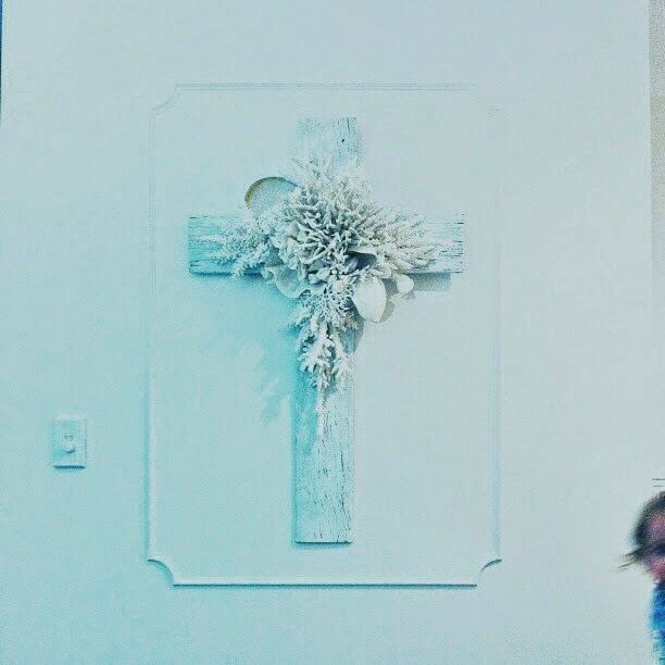
My treasured cross and playroom.

.jpg)
Choosing the right paper to complete the look and of course feel!

Our guest bedroom with Christian Lacroix wallpaper
Tickled pink with my crochet bed canopy found at Vinnie's which I used as a bed skirt.
Tickled pink with my crochet bed canopy found at Vinnie's which I used as a bed skirt.
How I used wallpapers
The smaller room under the stairs become our guest bedroom with its carefully considered wallpaper designed to catch your eye from the entry hallway and make the room feel bigger and more inviting.
The powder room also used wallpaper to achieve the same effect.
I used five different types of wallpapers throughout our home to intrinsically tell each spaces story. Distinct colours, patterns and textures were selected to define each space and seamlessly transition the occupant from formal to informal areas.


Finding a paper that was subtle, impressive and formal, whilst still gelling with the other papers I used throughout our home was the challenge for the entry vestibule. This paper was from Designers Guild.
I am resisting the urge to keep walking you through the rest of our home but I fear we will be here for a while. In part 2, which I'll try and post tomorrow, I'll show you the back of the house, the 1980's addition. This is my favourite part, our very happy space, perfectly reimagined for my family and I.
See you then.
B
x
To be continued.... PART TWO HAS NOW BEEN PUBLISHED!
No comments:
Post a Comment
I would love to hear from you and appreciate all comments.