Before we jump right in, have you read PART ONE? If not it's best to catch up before continuing.
Healing the 80's addition of our home
(Cont.)......Even though the front part of the house had obvious challenges, it was the back part of our home that initially made me turn away.
The proportions were all wrong. With two small pavilions housing a family room and a kitchen come dining room, it seemed unlikely to me that a busy family of five could comfortably operate within its walls.
I remember touring our home that very first time.....turning the corner into the kitchen, expecting to see a vast open plan space. Instead, I spotted the jarring western wall, right at the end of the dining area and I tried to make sense of it, asking myself where is the rest of the house? Surly this can't be all....but it was. It felt so wrong, so unfished, so dead. I then turned around and walked out saying, no thank you.
The old saying ‘you won’t find your home, it will find you’ sure rings true for me. It was my destiny to own and heal this home, even though I didn't know it on that very first visit.
Real Estate agent's BEFORE shot. It's a bit brown.

_(3_31_2014_11_32_58_AM).jpg)

Bohemian style textiles.
Making our space the best it could be
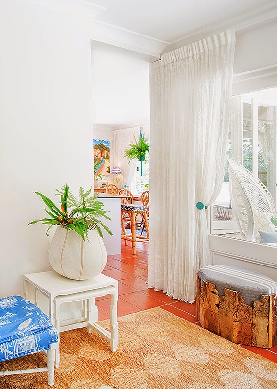
Many tricks to the trade were employed to make the back part of our home flourish and become a space we love. Probably the most significant improvement was adding nine white cotton lace curtains to soften the space, by sympathetically improving the flow and framing the vistas.
Without these curtains the space was incredibly harsh, especially the family room junction that radically flowed into kitchen.
The other essential ingredient was locating the right artwork for that problem western wall in the dining area.
I became fixated on finding a piece that would transcend the space beyond its physical boundary and heal the unsettling energy within the room. My main intention was to find a piece that matched the strong vibration of the pool and inject our kitchen with colours that literally lifted the space and increased its flow.
Thirdly, covering as much of the terracotta floor with a natural fibre matting, to appear like a wall-to-wall floor covering, was critical to increasing the scale of the space and to implant a cosiness.
Even though this rug was probably one of the more expensive purchases, it was one of the most critical ones. It provided a stable base palette where I could begin to layer my furnishings to create a truly liveable, colourful and warm setting. It also improved the acoustic natural of the space and it physically shielded the room from being a transient thoroughfare, instead making it a wholly identifiable space in its own right.
.jpg)


Gorgeous Irish au-pair Kym holding up the curtains.
Kids and curtains can mix! We taught our kids to look after our space which they do embrace most of the time.
I was so excited to see if my inclination of using a semi-transparent lace curtain would soften that awkward junction as well as I had hoped. The natural fine cotton gauze of the lace is incredibly beautiful and juxtaposes beautifully with the terracotta tiles.
Once my curtains were up I lived with them closed for a while, just to experience their beauty. Ordinarily they remain open and are more decorative (but absolutely functional) if you get my gist.
Once my curtains were up I lived with them closed for a while, just to experience their beauty. Ordinarily they remain open and are more decorative (but absolutely functional) if you get my gist.
The confusing junction looking through two glass windows now healed.
Large area rug toned down the cold terracotta. And of course, our artwork, that energetically guides us into the room and makes us not want to leave.
_(3_31_2014_11_32_58_AM)+(4).jpg) Our kitchen feels alive with lots of plants and modern day macramé. Achieving this look and the function we needed, without spending a lot of money, was the greatest result for us. Had we of stretched ourselves financially with all new furniture and a new kitchen the space just would not of had the same effect on our wellbeing. It truly was a healing space for us all to enjoy.
Our kitchen feels alive with lots of plants and modern day macramé. Achieving this look and the function we needed, without spending a lot of money, was the greatest result for us. Had we of stretched ourselves financially with all new furniture and a new kitchen the space just would not of had the same effect on our wellbeing. It truly was a healing space for us all to enjoy.
Making a small space work
When it came to selecting our family room furniture I was faced with the challenging proportions of the room's width which didn't allow for two sofas or a coffee table. Essentially, the room was the thoroughfare to the kitchen, so I was mindful of keeping good circulation without compromising the location of the TV or a comfy settee.
Knowing that larger pieces in a smaller room often create an illusion of space, I decided on an extra deep white cane settee. I re-covered it with family friendly textiles and piled it with an oversized bolster and custom scatters cushions.
Knowing that larger pieces in a smaller room often create an illusion of space, I decided on an extra deep white cane settee. I re-covered it with family friendly textiles and piled it with an oversized bolster and custom scatters cushions.

Before shot. Interesting to notice how the style of the before and after shots are quite similar, in particular the cane furniture and artwork.

Our family room. My favourite space.
Whilst this photo looks very busy, the actual experience did not feel cluttered. What one can't accurately appreciate here, is the depth of the room. Being a thoroughfare, it was equally a space to experience and enjoy as you walked through it, as much as it was one to enjoy when you sat down to relax. It was my intention to gradually prepared the occupant, with the layering and placement of blended colours, patterns and textures, for what they might expect around each corner. I wanted to create a very harmonious experience.

Darci grabs a table from the nest of side tables.

We truly love hanging out here. The soft lace curtains felt so gentle and soothing as you transitioned from the hallway into this new an vibrant casual family space. Pops of happy yellow & restful green harmoniously sit with the sea of blue.
Getting the scatter cushion combo right was more like a science than an art. I very carefully considered the size of each and the way they would be layered to ensure they visually balanced the space. I wanted them all to have a natural casual appeal that only linens and quality cottons accomplish. Each cushion was detailed with a mix of toggles, frayed fringes, tassels and cords to create a bespoke collection that would wow you as you turned the corridor. The bolster cushion and settee upholstery used a hardy child proof faux suede which I could machine wash effectively.
Finding the right fabrics involved considered thought and relentless searching. There were many edits before finding the right scheme. Playing with cushion sizes was also a big part of pulling off the eclectic mix to ensure patterns and colours were well represented. Initially, I found it difficult to steer away from the classic palette of blue & white. I could have designed 100's of workable blue & white schemes but I am so glad I persisted with finding a more colourful, (a more 'us'), ensemble.


Can you see the lamp shade in the background? Luckily this was one of the only mistakes I made; a beautiful shade but the print was too small for what I felt the room needed. I locked it down prematurely and consequently it wasn't right for the subsequent fabrics and elements I became intent on using.

Fabric swatches and the original creamy wall colour (which I found so hard to live with).
Despite using lots of blue in our scheme it was the pops of yellow and orange that I injected later that tied it all together.
Read more about my scatter cushion journey here!
.jpg)
Achieving a co-ordinated array of colour and pattern was my intent. I'm not a fan of mismatch. I need tonal harmony to feel content in my spaces.
I think my favourites are the two round yellow rose cushions made from a vintage oilcloth I bought off Etsy.
Etsy was such a wonderful resource for finding unique vintage pieces.
.jpg)
Whilst I did want a hint of bohemian I didn't want it to have the messy or clashing / dashing appeal of Boho.
I wanted it have a more vintage sentiment that was very restful and in integrity to the grandeur of the home.
I wanted it have a more vintage sentiment that was very restful and in integrity to the grandeur of the home.

Floor Runner at base of step.
The floor runner I used at the base of the step shown here is an important element. From the perspective looking towards the cubby house, when I remove this runner, suddenly the room shrinks in size, (it was my space healing party trick performed on many guests). Essentially the runner visually connects the family room as part of the terrace vestibule and gives the room the extra length it so desperately needed. Layering a space to positively influence its size is one of the greatest design principles one can use. Its impact never ceases to amaze me.
Discovering a home’s unique style
As we became more intimately acquainted with our home, it was clear that a 70's vintage feel with a hint of bohemian was the perfect style for the backend, complimenting the poolside location and terracotta tiles.
Adding bright and cheerful colours for my three young children to enjoy and fondly associated to their childhood, was also my express aim.
I am a big believer that all homes have their own special flower, one that looks so much better than any other flower within its walls. For our Cremorne home it was white lilies, but just sightly opened ones, and for our Neutral Bay home it is most certainly roses. We planted roses outside, I used roses on five of the textiles inside and I filled vases with fresh roses on a weekly basis. Recently we planted a Lamarque climbing rose to crawl over our new entry arbor that frames our entry gate.

Our Bohemian shell pendants.

Roses on the lace curtains.
+(2).jpg)

Having a pool wasn't a requirement for us but a huge bonus. It brings me endless enjoyment to look at it each day, as well as use.
Having it so close to the home was also an advantage I couldn't have appreciated until experiencing.
Having it so close to the home was also an advantage I couldn't have appreciated until experiencing.
.jpg)
Roses in the garden.
Prepare to change focus
It was interesting to observe how our priorities changed after the first few months of living in our home. Initially, I was convinced we had to use our budget on building a bay window for the white cane settee to slot into, making the room wider. As I began to decorate and witness how we used the space, this desire subsided. New priorities started making themselves known.

Dreaming of a beautiful big bay window right here with two pocket side windows overlooking the pool and garden.
Picture of my Eva Hannah original panting before I had it reframed. What a difference a frame makes! Read more about our gorgeous painting here!

.JPG)
Never second guess where you'll find inspiration....Barbie's Dream House had the ideal bay window design.

+(2).jpg)
Never second guess where you'll find inspiration....Barbie's Dream House had the ideal bay window design.
I'll have to find another spot for the clothesline when we get the bay window. Never a dull moment, always compromising and problem solving.
But for the time being, this works just fine for now. The bay window can wait.
There is always a solution
Our back door is our main access into and out of our home, simply because it is above our garage. The feelings I had when I walked into our home from this entry become very important to me and it was definitely an area that needed some love.
As I walked into the room, the wall that lead from the terrace vestibule into the hallway appeared to be a dead-end. I hated the way the house appeared to stop right at this point without any directional queues suggesting there were other spaces to explore. It felt disjointed and unsettling.
I started experimenting with layering the space, adding the hanging macramé planter, back lighting it and most significantly selecting a wall paper that literally had a directional queue in its design guiding you into the hallway. I was surprised and relived to see how well this solution resolved this problem area and instantly improved not only my enjoyment of the space but the flow.

Renato hanging our paper. What a gem he is! Paper source.
.jpg)
Our TV nook with a 5th & final feature wallpaper. Floating angled shelves installed.
And my beautiful macramé hanging planter which I blogged about here!
And my beautiful macramé hanging planter which I blogged about here!
I found this video that I want to share. It shows our space in progress. Notice the wallpaper sample on the sideboard. It did take a big dose of courage to use such a bold pattern and a few weeks spent walking past it daily to see how it grew on us. Notice too the old skirting boards or half rounds I should say, they are hardly skirting boards!
Creating illusions
The other bone of contention that started creeping in was the hobbit like doorway which led out to the terrace. It felt incredibly low and appeared even lower from the stepped up family room. I couldn't actually believe I was about to tell my husband I needed more curtains to resolve this dilemma. But it had to be done, so I began to play with all types of drape designs to give the illusion of height and added some stunning turquoise beaded tiebacks that I carefully positioned higher than normal.
I think this is my favourite detail of the home. It frames a beautiful vignette from the back door and another as you walk down the hallway.
I think this is my favourite detail of the home. It frames a beautiful vignette from the back door and another as you walk down the hallway.

I love the softness created by puddling the curtains on the floor.

.jpg)
Our turquoise beaded tiebacks - a worthy splurge.
The other curtains had a turquoise coloured rosette holdback.
+(3).jpg)
Backlighting the space to create extra dimension. Belgium linen striped fabric from Designs Of The Times.
Up-cycling
One of the first changes I made to our home was a simple kitchen makeover that included painting the existing cupboards with a soft metallic silver and subtle crosshatch brush stroke. I also added new handles and some shell chandeliers which shaded the three existing island counter down lights. I was so thrilled with how the chandeliers worked and blogged about it here.
Many of the furnishings in our home were up-cycled from places like eBay and thrift shops; the dining setting and buffet, vintage white cane cupboard, bar stools, macramé planter and antique entry sideboard to name a few.
Even the lace curtains were made up of 36 discontinued Scottish madras lace panels I bought off American eBay. I think my favourite up-cycled purchase was my Chippendale outdoor setting which I also blogged about here! But by far the most useful is the white cane cupboard which houses all our day to day stuff!

An impromptu visit from Soph & Edie on Ashley's 2nd birthday, not long after we moved in featuring furniture from our Cremorne home.

Kids eating while I experimented with swatches of silver paint shown here on the cupboard doors behind.

I ended up using Porters BU-2 PL-4 which has been amazingly hardwearing, offering a beautiful lustre and soft silver that blended with the Porters Milk wall colour used throughout the home.
.png)
Vintage cane cupboard bought from a second hand antique shop near Long Jetty NSW. I actually saw it in their facebook page and bought it unseen. Gotta love facebook!
.png)

Even on a rainy day this was a beautiful space to be in.

This first vignette that greeted you upon entering the dining pavilion looked straight down the galley kitchen. It was cold and unappealing. Adding a floor runner and a final curtain completely balanced the space and gave it the much needed warmth, often so hard to inject into a kitchen.
The second vista that caught your eye was the two large windows on the back wall. I found the empty column between these windows a real challenge. With nothing on the wall between the windows the room felt two dimensional because of its lacking depth. Adding the clock was the perfect solution. I hand painted its body in a soft blue wash so it was subtle enough whilst still catching your eye. And the chiming noise became a familiar sound we grew to loved.

Tamara Maynes yellow tassels along with the wall clock I bought from America really finished off the room. But for me it is the many plants that make the room sing.


Better picture showing the silver cupboards...excuse the mess!

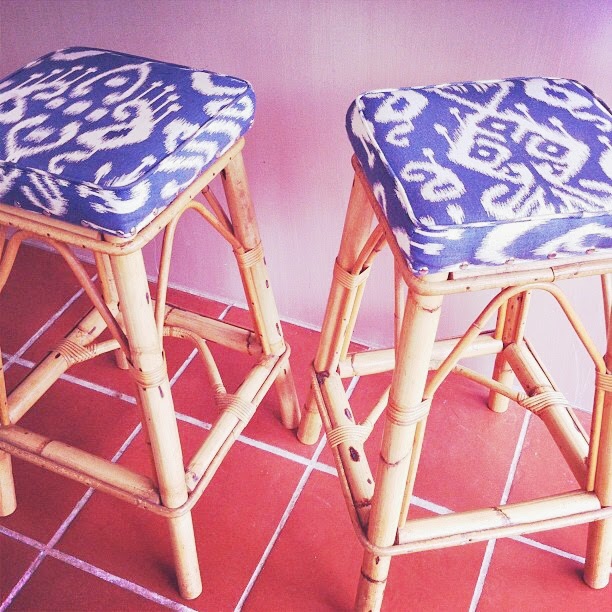
My barstools ready to go off to my upholsterer. It is all in the detail.
Specifying no pattern match was crucial to ensure they all came back unique, something I very much wanted.
My poolside pavilion of lace
I also had the good fortune of packing a few special Stuart Membery furniture pieces into a client's container that I was importing from overseas during this time. The stunning round Tangiers table is a treasured piece and was key to completing my vision.
The styling of the garden and pool area needed attention too. Three verdigrises’ herb troughs on the kitchen balcony, striped deck chairs and a special hanging vintage planter on the porch were just some of the garden delights that connected our interior to the magic of the outside world.
We also lifted six sandstone pavers to increase the size of the garden bed in the corner of the pool to make a tranquil fernery. This corner was my direct line of sight from my kitchen sink so I wanted to make a beautiful vignette here.
Before long my pavilion of lace, framed by the pool, palms, frangipani and ferns was complete. Any lack of space that was initially such a concern was soon forgotten.
+(2).jpg)


We scored these oversized maraya spheres from the set of Gatsby which we ended up moving closer together to frame the Chippendale dining setting. Getting troughs ready to make a herb garden on the kitchen balcony.
The styling of the garden and pool area needed attention too. Three verdigrises’ herb troughs on the kitchen balcony, striped deck chairs and a special hanging vintage planter on the porch were just some of the garden delights that connected our interior to the magic of the outside world.
We also lifted six sandstone pavers to increase the size of the garden bed in the corner of the pool to make a tranquil fernery. This corner was my direct line of sight from my kitchen sink so I wanted to make a beautiful vignette here.
Before long my pavilion of lace, framed by the pool, palms, frangipani and ferns was complete. Any lack of space that was initially such a concern was soon forgotten.
Our extended garden bed to accommodate our fernery with a round table I found at Vinnie's.
Verdigrises’ oversized Goblet Pots are finally in! We scored these oversized maraya spheres from the set of Gatsby which we ended up moving closer together to frame the Chippendale dining setting. Getting troughs ready to make a herb garden on the kitchen balcony.


.png)
.jpg)

Tangiers table by Stuart Membery


My vintage shell chandelier. A shell encrusted trinket box found at Rozelle markets.


Our extended garden bed for our ferns.
+(2).jpg)
Strung bare bulb lights and our terrace dining setting.
An interwoven & considered scheme
I could go on all day about other critical elements that healed our home and restored it's integrity; the free form cowhide, the impact of the many large lamps, the oversized carved mirror, the colourful artwork above the settee, all the plants, (I think I counted 17 indoor plants in this part of the home at one point) but hopefully the photos paint that story.
I have photographed my home almost exactly how we lived in it because my intent is not to show just pretty pictures but rather to showcase how a home works as a symbiotic relationship of interwoven spaces. No smoke and mirrors here, no manipulation of furniture or props (okay maybe a vase or two, or entry buffet arrangement!).
It really amazes me how easily we lived in this home, despite its lacking family room size. I put this success down to the fact that it is extremely comfortable and everything had a place, making daily life effortless and relatively mess free. My only gripe being the cushions didn't fluff themselves.

Timber carved Islander inspired mirror which just fit in. My round striped carved old tea chest ottoman found at Coco Republic is another favourite piece. I often sit here to eat breakfast.


This plant was heaven and had the perfect colours. All my lamp shades were custom made for the space.


I'm going to post my wrap up tomorrow. In part three I will talk about what Space Healing actually means to me and outline specific techniques you can employ. I promise it will be worth coming back for. I do hope you will join me for the conclusion of my three part series on Space Healing our home.
B
x
To be continued....PART THREE HAS NOW BEEN PUBLISHED!
Bronwyn I'm racing out the door to a jam packed day and don't have time to give this what it deserves at mo.....but wanted to say wowowow ...I love your cerebral yet instinctive process for this, adore your family room - can't wait to come back and read thoroughly - thank you Lyn wandering homebody)
ReplyDeleteLovely Lyn, Thank you for reading and commenting, it means a lot to me. Hope to see you in LA soon. B x
Delete